Across the nation, coastal urban centers are adding new citizens, while rural counties are seeing their populations decline. Outside of this general trend, fracking has created some rare pockets of growth in rural areas, while coal mine closures have had the opposite effect. Today’s map comes to us from Reddit user jinkinson, and it maps U.S. population change by county from 2010 to 2018, using data from the U.S. Census Bureau.
Uneven Growth
From 2010 to 2018, the total United States population increased by 6% from 308,745,538 to 327,167,434. However, it’s clear that not all counties participated in this uptrend. There are 3,142 counties counted as part of this map (Puerto Rico and U.S. territories excluded). Of these, 1,489 experienced positive growth, while 1,653 saw a decline.
Which Counties are Growing the Fastest?
America’s economy has grown for over a decade, but that growth increasingly concentrates in 1% of the nation’s counties.
In fact, just 31 counties were responsible for 32.3% of the U.S. gross domestic product (GDP) in 2018, according to data from the Bureau of Economic Analysis.
Although economic concentration tells part of the story, a view of changing population patterns can help us see where physical growth is happening across the country.
Top 20 Counties for U.S. Population Growth
At the top of the list is McKenzie County, North Dakota, which experienced a growth of 114% in its population from 2010 to 2018. This is due to the shale gas industry that flourished in the area. Interestingly, all of North Dakota’s active oil and gas rigs are in just four counties: McKenzie, Dunn, Williams, and Mountrail, three of which make the top 20 list above.
The fracking boom also fueled growth in Texas, where six counties made the list.
However, immediate economic success built on fracking sands and sensitive commodity prices may not be sustainable over the longer term. In fact, counties from a previous energy era are already seeing what happens when demand dries up.
Which Counties are Declining the Fastest?
If you look at a map of coal operations in the U.S. and compare it to the list of declining counties below, a stark pattern appears. Half of country’s coal miners work in just 25 counties, and as mines close there are fewer economic opportunities available in those areas. Top 20 Counties for U.S. Population Decline While coal counties have grim figures due to the changing domestic energy story, it’s Alexander County in Illinois that tops the list with a 26% decline in population over the time period. In fact, the harsh reality is that 93% of Illinois’ counties have seen a decrease in population between 2010-2018.
State by State: Winners and Losers
The number of declining counties within a state reveals a larger picture. Visual Capitalist aggregated county level data to reveal the patterns of U.S. states. Illinois tops the list with the most people leaving its counties, while areas such as the District of Columbia and Delaware experienced no declines. What happens to a state where the majority of its counties are losing residents?
The Big Picture
Americans are seeking out opportunity where it resides: in the cities. The pursuit of fracking oil and gas created opportunities in regions beyond the coast or traditional urban centers.
However, the long term trend of concentration of people on coasts and in major urban centers will continue to impact infrastructure spending, labor mobility, and economic activity. America no longer derives the majority of its economic success from rural counties and industries.
It is unclear how rural counties will fare as their denizens continue to dwindle. What is clear is that the few that rely on natural resources for success will continue to experience the ups and downs of volatile commodity markets.
on
#1: High Reliability
Nuclear power plants run 24/7 and are the most reliable source of sustainable energy. Nuclear electricity generation remains steady around the clock throughout the day, week, and year. Meanwhile, daily solar generation peaks in the afternoon when electricity demand is usually lower, and wind generation depends on wind speeds.As the use of variable solar and wind power increases globally, nuclear offers a stable and reliable backbone for a clean electricity grid.
#2: Clean Electricity
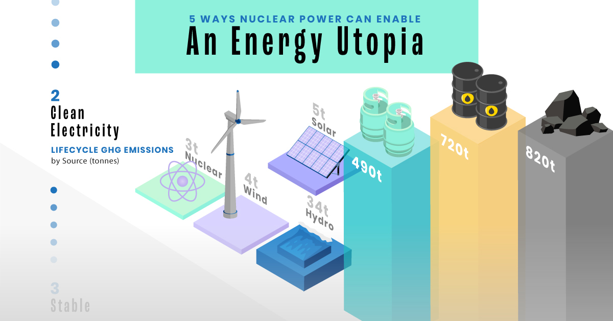
Nuclear reactors use fission to generate electricity without any greenhouse gas (GHG) emissions.Consequently, nuclear power is the cleanest energy source on a lifecycle basis, measured in CO2-equivalent emissions per gigawatt-hour (GWh) of electricity produced by a power plant over its lifetime. The lifecycle emissions from a typical nuclear power plant are 273 times lower than coal and 163 times lower than natural gas. Furthermore, nuclear is relatively less resource-intensive, allowing for lower supply chain emissions than wind and solar plants.
#3: Stable Affordability
Although nuclear plants can be expensive to build, they are cost-competitive in the long run. Most nuclear plants have an initial lifetime of around 40 years, after which they can continue operating with approved lifetime extensions. Nuclear plants with lifetime extensions are the cheapest sources of electricity in the United States, and 88 of the country’s 92 reactors have received approvals for 20-year extensions. Additionally, according to the World Nuclear Association, nuclear plants are relatively less susceptible to fuel price volatility than natural gas plants, allowing for stable costs of electricity generation.
#4: Energy Efficiency
Nuclear’s high energy return on investment (EROI) exemplifies its exceptional efficiency. EROI measures how many units of energy are returned for every unit invested in building and running a power plant, over its lifetime. According to a 2018 study by Weissbach et al., nuclear’s EROI is 75 units, making it the most efficient energy source by some distance, with hydropower ranking second at 35 units.
#5: Sustainable Innovation
New, advanced reactor designs are bypassing many of the difficulties faced by traditional nuclear plants, making nuclear power more accessible.
Small Modular Reactors (SMRs) are much smaller than conventional reactors and are modular—meaning that their components can be transported and assembled in different locations. Microreactors are smaller than SMRs and are designed to provide electricity in remote and small market areas. They can also serve as backup power sources during emergencies.
These reactor designs offer several advantages, including lower initial capital costs, portability, and increased scalability.
A Nuclear-Powered Future
Nuclear power is making a remarkable comeback as countries work to achieve climate goals and ultimately, a state of energy utopia. Besides the 423 reactors in operation worldwide, another 56 reactors are under construction, and at least 69 more are planned for construction. Some nations, like Japan, have also reversed their attitudes toward nuclear power, embracing it as a clean and reliable energy source for the future. CanAlaska is a leading exploration company in the Athabasca Basin, the Earth’s richest uranium depository. Click here to learn more now. In part 3 of the Road to Energy Utopia series, we explore the unique properties of uranium, the fuel that powers nuclear reactors.


