Today’s visualization outlines the sharp losses China’s economy has experienced, and how this may foreshadow what’s to come for countries currently in the early stages of the outbreak.
A Historic Slump
The results are in: China’s business activity slowed considerably as COVID-19 spread. *Excluding rural household investment As factories and shops reopen, China seems to be over the initial supply side shock caused by the lockdown. However, the country now faces a double-headed demand shock:
Domestic demand is slow to gain traction due to psychological scars, bankruptcies, and job losses. In a survey conducted by a Beijing financial firm, almost 65% of respondents plan to “restrain” their spending habits after the virus. Overseas demand is suffering as more countries face outbreaks. Many stores are closing up shop and/or cancelling orders, leading to an oversupply of goods.
With a fast recovery seeming highly unlikely, many economists expect China’s GDP to shrink in the first quarter of 2020—the country’s first decline since 1976.
Danger on the Horizon
Are other countries destined to follow the same path? Based on preliminary economic data, it would appear so. The U.S. About half the U.S. population is on stay-at-home orders, severely restricting economic activity and forcing widespread layoffs. In the week ending March 21, total unemployment insurance claims rose to almost 3.3 million—their highest level in recorded history. For context, weekly claims reached a high of 665,000 during the global financial crisis.
—Chris Rupkey, Chief Economist at MUFG in New York In addition, manufacturing activity in eastern Pennsylvania, southern New Jersey, and Delaware dropped to its lowest level since July 2012. Globally Other countries are also feeling the economic impact of COVID-19. For example, global online bookings for seated diners have declined by 100% year-over-year. In Canada, nearly one million people have applied for unemployment benefits. Hard-hit countries such as Italy and Spain, which already suffer from high unemployment, are also expecting to see economic blows. However, it’s too soon to gauge the extent of the damage.
Light at the End of the Tunnel
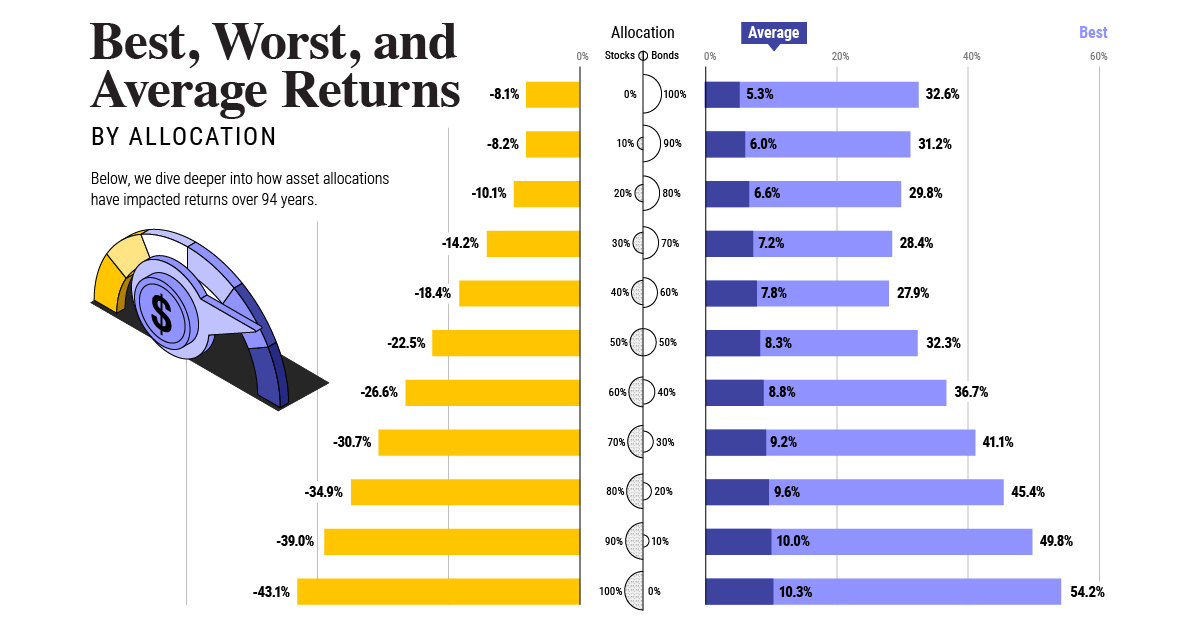
Given the near-shutdown of many economies, the IMF is forecasting a global recession in 2020. Separately, the UN estimates COVID-19 could cause up to a $2 trillion shortfall in global income. On the bright side, some analysts are forecasting a recovery as early as the third quarter of 2020. A variety of factors, such as government stimulus, consumer confidence, and the number of COVID-19 cases, will play into this timeline. on Last year, stock and bond returns tumbled after the Federal Reserve hiked interest rates at the fastest speed in 40 years. It was the first time in decades that both asset classes posted negative annual investment returns in tandem. Over four decades, this has happened 2.4% of the time across any 12-month rolling period. To look at how various stock and bond asset allocations have performed over history—and their broader correlations—the above graphic charts their best, worst, and average returns, using data from Vanguard.
How Has Asset Allocation Impacted Returns?
Based on data between 1926 and 2019, the table below looks at the spectrum of market returns of different asset allocations:
We can see that a portfolio made entirely of stocks returned 10.3% on average, the highest across all asset allocations. Of course, this came with wider return variance, hitting an annual low of -43% and a high of 54%.
A traditional 60/40 portfolio—which has lost its luster in recent years as low interest rates have led to lower bond returns—saw an average historical return of 8.8%. As interest rates have climbed in recent years, this may widen its appeal once again as bond returns may rise.
Meanwhile, a 100% bond portfolio averaged 5.3% in annual returns over the period. Bonds typically serve as a hedge against portfolio losses thanks to their typically negative historical correlation to stocks.
A Closer Look at Historical Correlations
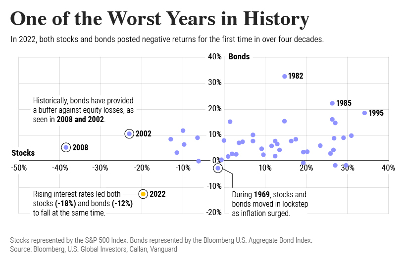
To understand how 2022 was an outlier in terms of asset correlations we can look at the graphic below:
The last time stocks and bonds moved together in a negative direction was in 1969. At the time, inflation was accelerating and the Fed was hiking interest rates to cool rising costs. In fact, historically, when inflation surges, stocks and bonds have often moved in similar directions. Underscoring this divergence is real interest rate volatility. When real interest rates are a driving force in the market, as we have seen in the last year, it hurts both stock and bond returns. This is because higher interest rates can reduce the future cash flows of these investments. Adding another layer is the level of risk appetite among investors. When the economic outlook is uncertain and interest rate volatility is high, investors are more likely to take risk off their portfolios and demand higher returns for taking on higher risk. This can push down equity and bond prices. On the other hand, if the economic outlook is positive, investors may be willing to take on more risk, in turn potentially boosting equity prices.
Current Investment Returns in Context
Today, financial markets are seeing sharp swings as the ripple effects of higher interest rates are sinking in. For investors, historical data provides insight on long-term asset allocation trends. Over the last century, cycles of high interest rates have come and gone. Both equity and bond investment returns have been resilient for investors who stay the course.
